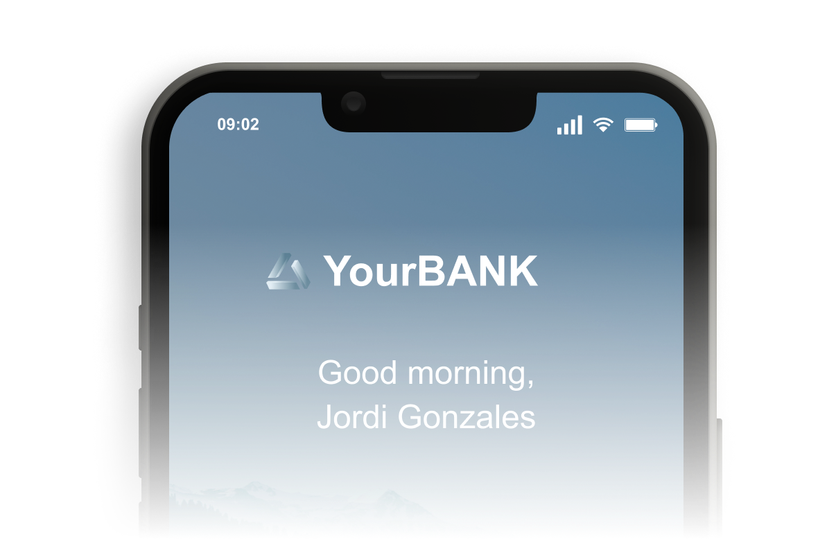
UPF · Bank app · 2016–2017
Mobile Bank
Project Focus Areas
0 to 1
Complete end-to-end mobile app workflow validation
2 Core Flow Areas
Dynamic transactional journey and account dashboard optimization
Multi-Market
UI layouts designed to adjust flexibly across distinct user target regions
Personalization
Segmented home screens adaptive to active user account states

Client
UPF internal client
My role
UX/UI Designer
tools
Illustrator · InVision

phase 00
Context & challenge
Mobile banking applications often struggle to strike a balance between structural financial security and smooth interaction patterns. While highly functional on paper, complex banking platforms routinely present cognitive friction to users attempting simple tasks. Users frequently find themselves overwhelmed by unorganized transactional data or experience an implicit lack of contextual confidence when moving through deep-level features.
The objective of this design exercise was to re-architect high-traffic banking touchpoints, making financial tools inherently clear and transparent without introducing procedural risks or visual clutter.
“How might we optimize complex financial entry points to create fluid user paths without sacrificing security parameters or operational context?”
Phase 01
Research & Discovery
I audited common digital banking pipelines and conducted user interviews to map out the psychological drop-off points during basic account actions and layout interactions.
Insight 1 (Wrong UI Placement): The primary value features and advanced balance management options were being offered in the wrong parts of the user interface. They appeared too late during sections of heavy informational load where users were focused on trivial actions, causing them to treat them as intrusive noise or overlook them entirely.
Insight 2 (The Transactional Misconception): Users did not immediately understand structural balance rules or processing fees. They failed to realize how pending credits or variable transaction deductions operated relative to their immediate liquid total.
Insight 3 (Hidden Value Parameters): Important account benefits, financial health summaries, and limit thresholds were completely obscured by dense, buried secondary sub-menus, hiding the app’s real utility.
Insight 4 (The Security-Velocity Mismatch): Users assumed that optimizing for speed meant compromising security checkpoints. This created an underlying hesitation when completing sensitive actions if clear feedback cues weren’t consistently presented.
Phase 02
Ideation & validation
Instead of modifying superficial visual assets on the fly, I built structural layout hypotheses to clarify the transactional model and tested them through iterative interactive frameworks.
Hypothesis Tested
I hypothesized that displaying the right data at the exact right moment, while being more conscious about who sees specific financial options and when they encounter them in the flow, would significantly improve user interaction metrics.
WHAT WE LEARNED
Transparency and the deliberate placement of the feature within the overall application architecture were the absolute key factors in improving task success. Aligning user intent with early dashboard touchpoints and being clear about transactional boundaries instantly lowered user hesitation.
Phase 03
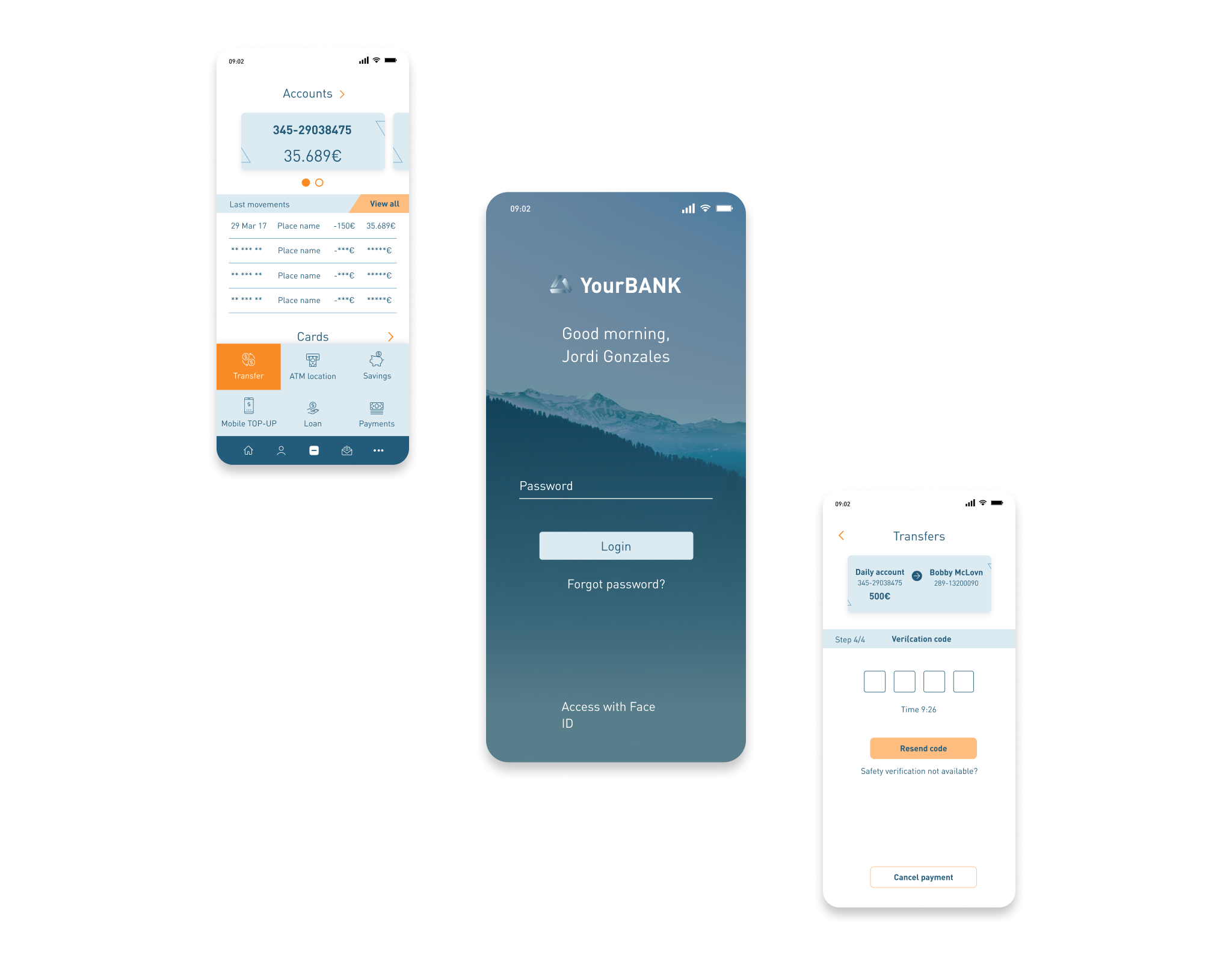
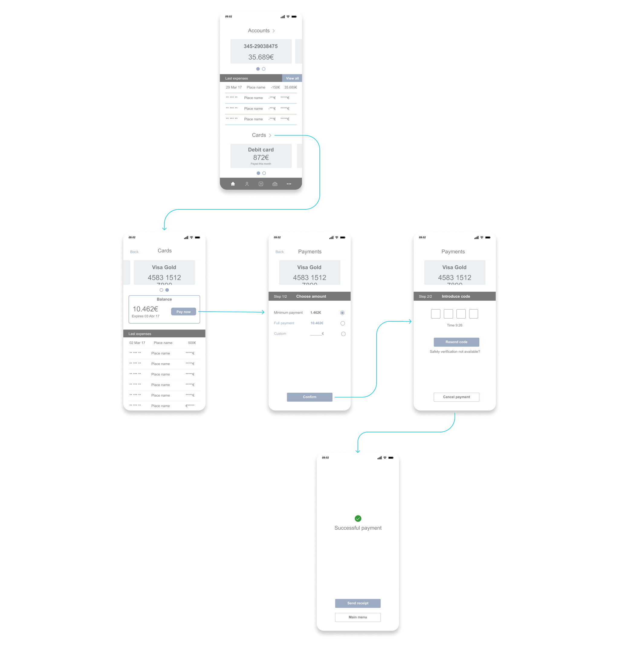
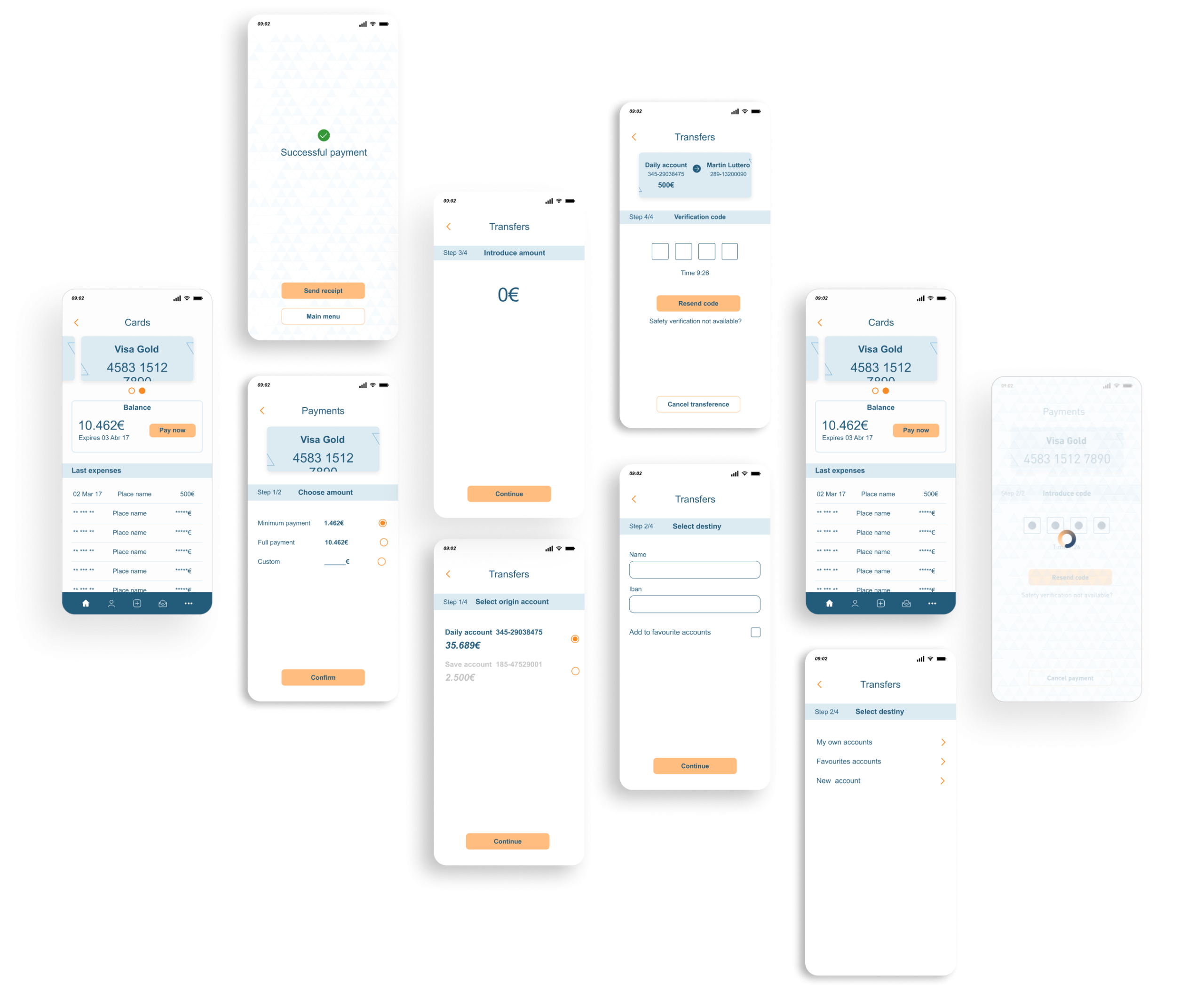
UI Definition & Solution
The final interface systematically overhauled the application’s visual hierarchy across mobile viewports. I re-architected the main account dashboard, updated the balance visualization components, and redesigned the transfer verification screens to explicitly reinforce safety indicators and curb transactional anxiety.


Additionally, I designed a completely new touchpoint to introduce services right at the beginning of the application funnel, capturing users immediately when they open the app with clear search intent. This entry point did not rely on a generic template layout; instead, the UI delivery was dynamically tailored to a specific public market, adaptively changing its presentation based on the active type of search research being performed and the user profile attributes if the account was logged in.

Conclusions
Project analysis
Outcome
The design prototype successfully demonstrated a clear visual architecture, verifying that layout clarity and smart entry-point positioning are direct drivers of user confidence in fintech ecosystems.
Retrospective
When designing mobile banking apps or digital wallet products, clarity and timing are everything. Forcing a complex element into a late, high-friction task creates unnecessary confusion; introducing and segmenting features where they natively match user intent transforms standard workflows into highly intuitive tools.

