Hewlett-Packard · Print Software · 2019–2021
HP Click
project impact
WCAG 2.1 compliant
First product in the program to reach accessibility compliance
-16%
Reduction in usability-related tickets after the redesign shipped
+19%
Usage increase in the product after redesign

Client
Hewlett-Packard
Team size
1 Lead engineer · 1 Product Manager
1 UX designer · 1 Visual designer
2 Front end devs · 2 Back end devs
My role
UI Designer & Accessibility Specialist
tools
Axure RP 9 · Adobe XD · Jira

phase 00
Context & challenge
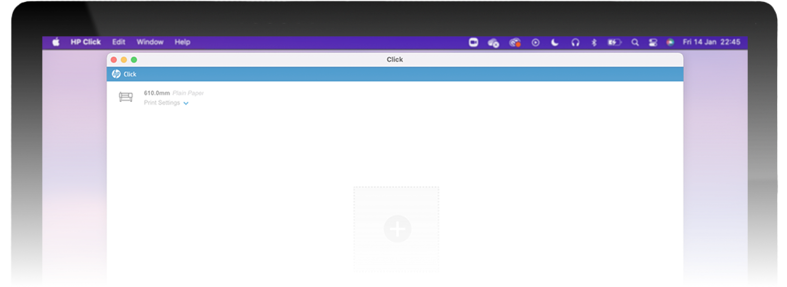
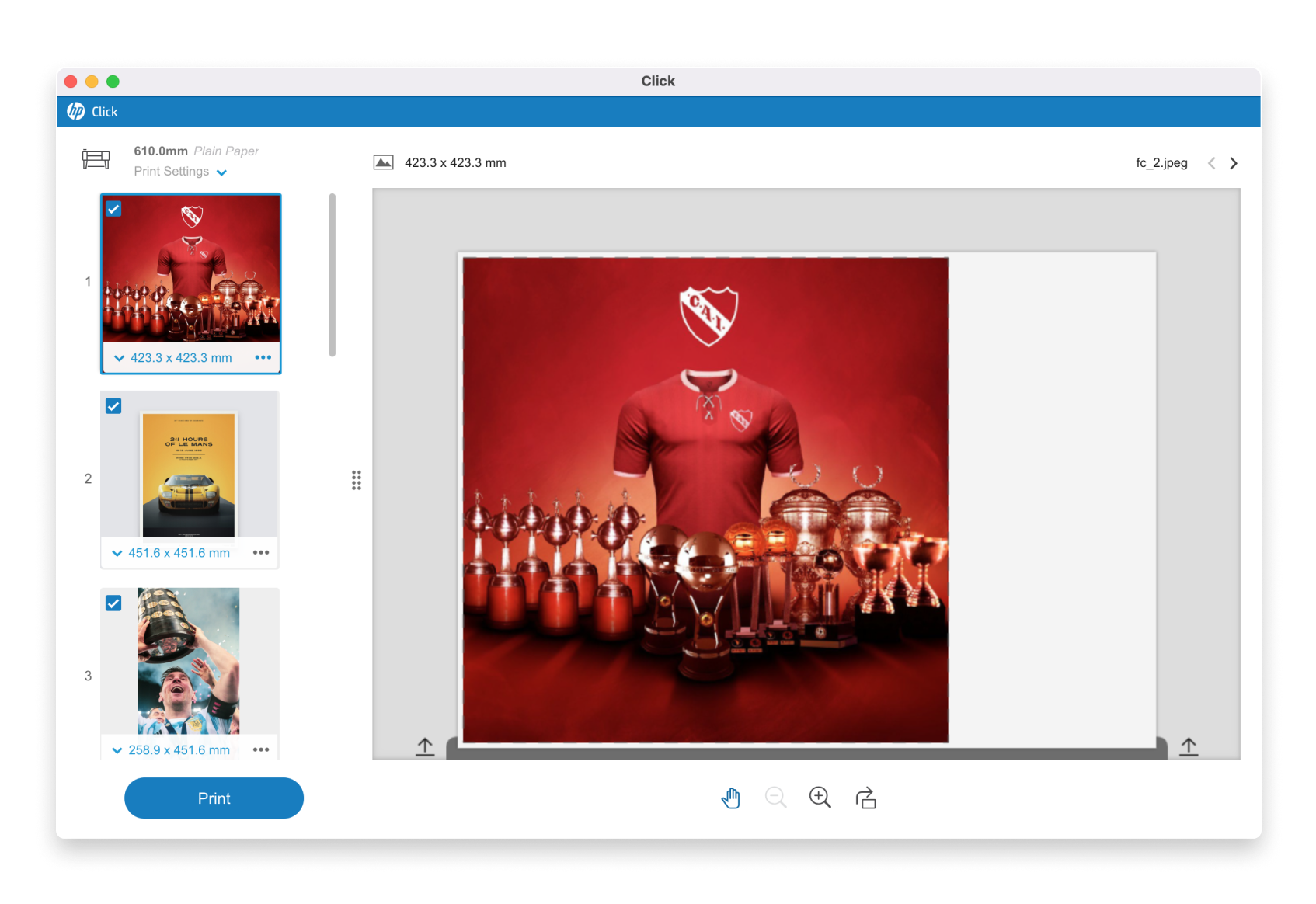
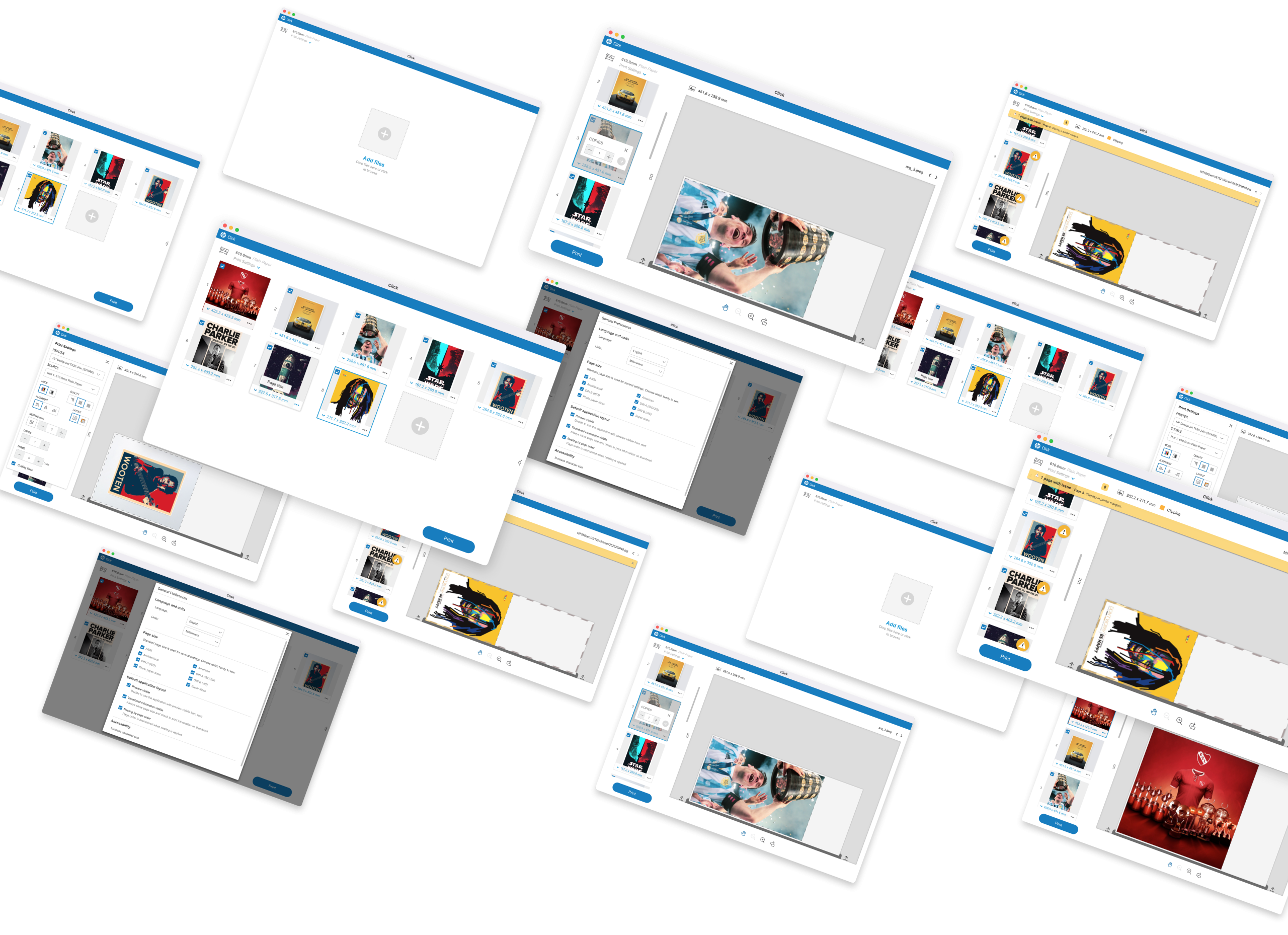
HP Click is a print preparation tool for HP DesignJet and PageWide XL printers. It’s built for people who don’t think in “print settings” — the goal is to get from file to printed output in a few clicks, without forcing users into a professional print-shop mindset.
When I joined, a new version was already in planning. The core issue was discoverability: users couldn’t find the tools and settings they needed, because the existing layout didn’t match how people actually approached the task. Features were grouped by how the system worked internally, not by what users were trying to do. On top of that, the visual design needed a refresh. So the redesign covered both a visual restyle and a rework of the product’s information architecture — regrouping features and tools, and rethinking the behavior of each, to align with users’ mental models and expectations.
“How might we reorganize HP Click so people find the right tool the moment they need it, without turning a simple product into a complex one?”
Phase 01
Research & Discovery
We worked from two sources: patterns in customer support tickets, and direct user interviews and usability testing in HP’s lab. This combination helped separate “what users say is wrong” from “what’s actually causing them to get stuck.”
Insight 1: Most friction came from discoverability, not from missing functionality — users often couldn’t find tools that already existed because of how they were grouped and labeled.
Insight 2: Several stakeholder requests were for advanced, professional-grade printing features that belonged to a different HP product aimed at print shops. Adding them would have worked against HP Click’s core philosophy (simple, few clicks, no steep learning curve), so I pushed back and recommended adapting or rejecting those requirements to protect the product’s core experience for everyday and small-business users.
Insight 3: For double-sided printing on large-format pages, there’s no single standard for how people expect a page to “flip.” We found two common but contradictory mental models among users — meaning the UI needed to actively show the correct orientation, rather than assume users would know it.
Phase 02
Ideation & validation
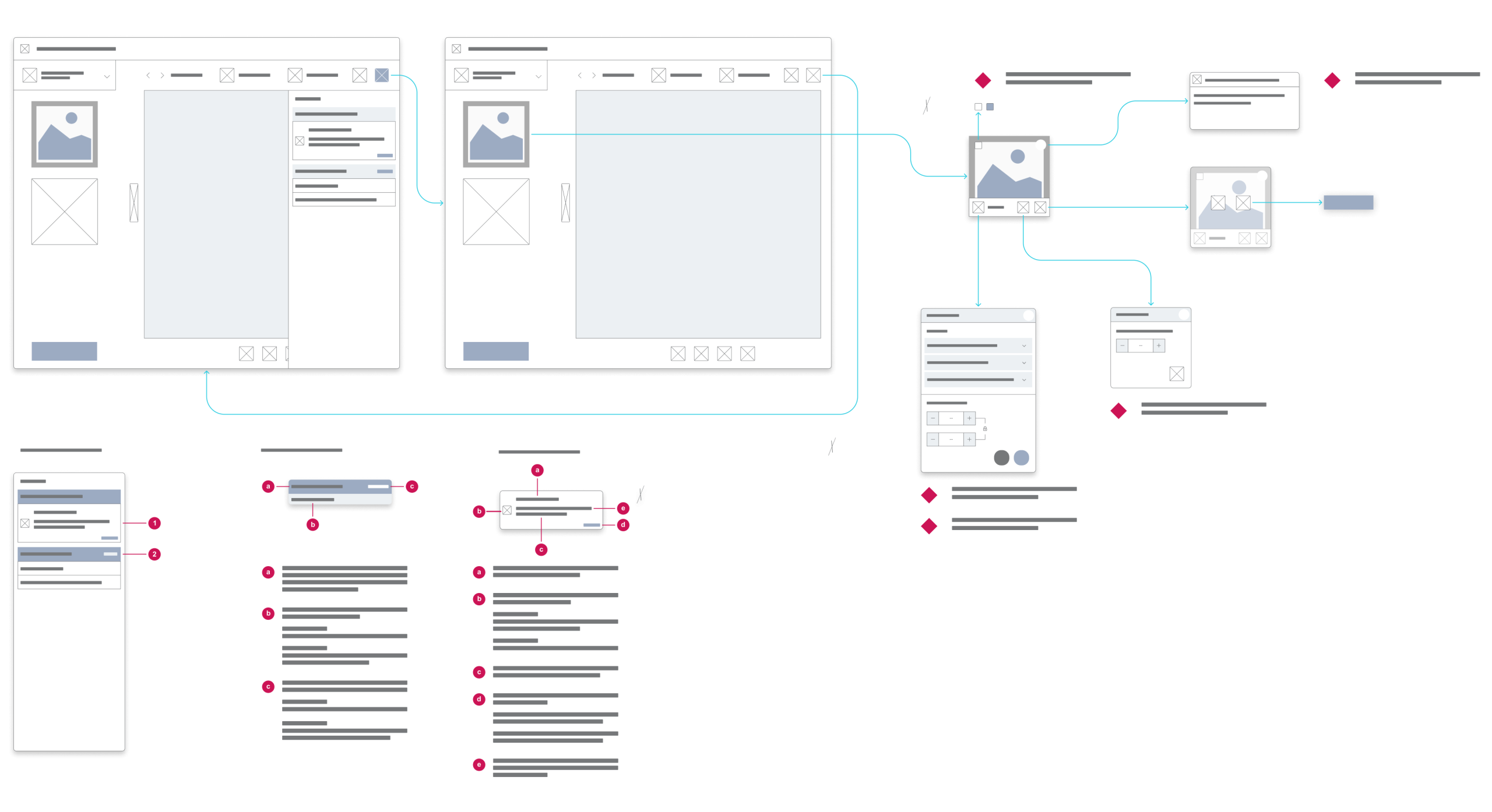
The redesign touched the product’s overall architecture, but the areas that needed the most iteration were queue management, print preview, and — the trickiest one — the double-sided printing flow.
The double-sided printing case is a good example of the process. Because two conflicting “flip direction” mental models existed among users, we first ran tests to understand how people actually expected the page to flip. From there, I built prototypes representing both directions and tested again in the lab to find which visual representation made the correct orientation clear, regardless of which mental model a given user started with.
Hypothesis Tested
Users would intuitively understand which way a double-sided large-format page would flip when printed, based on existing conventions.
WHAT WE LEARNED
They didn’t — two contradictory conventions existed in parallel. The UI needed to explicitly visualize the correct flip direction rather than rely on user assumptions.
Phase 03
UI Definition & Solution
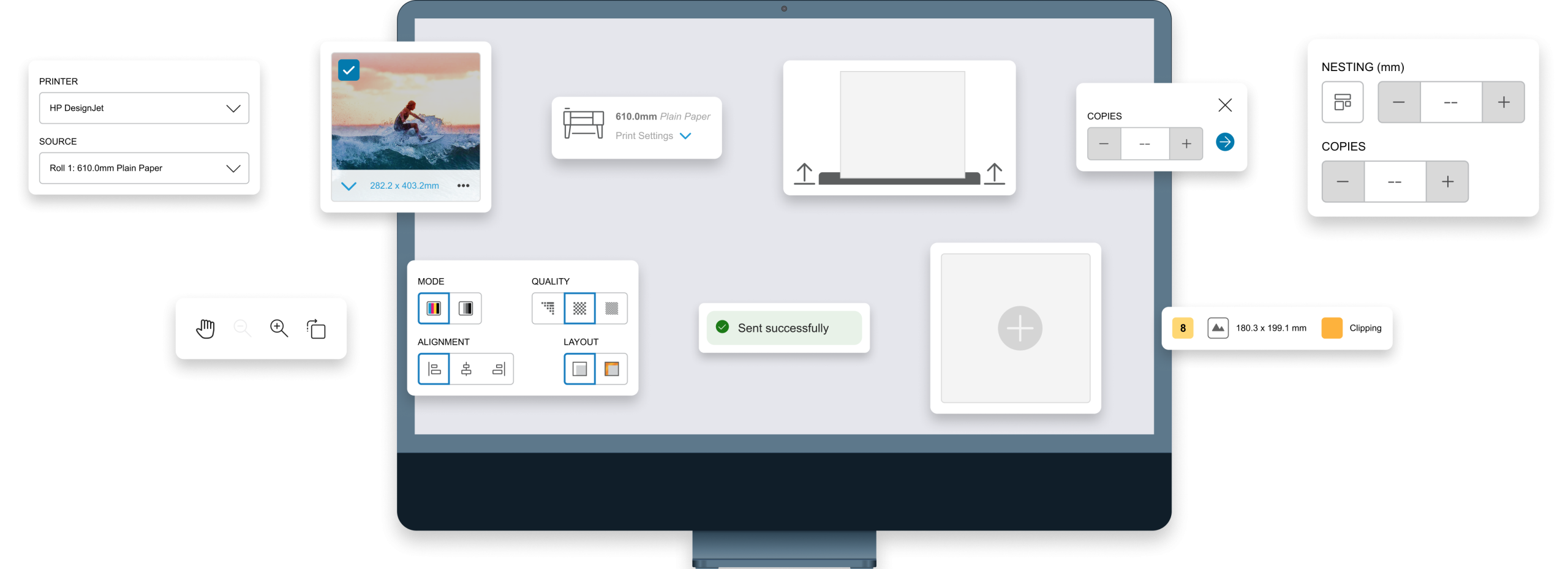
What shipped was a full visual redesign paired with the new information architecture: tools and features were regrouped and their behavior adjusted to match how users approached the task, reducing the “where is this?” friction that came up repeatedly in research.
On the accessibility side, this version became the first in the program to meet WCAG 2.1 standards. That meant auditing and redesigning components that failed color contrast requirements, and implementing full tab/keyboard navigation throughout the product — something no previous version had. I was the designer responsible for accessibility on this product, working alongside HP’s accessibility team and the visual designers who also factored accessibility into their work.
Conclusions
Project analysis
Outcome
The redesign shipped with full WCAG 2.1 compliance, a reorganized IA, and a clearer double-sided printing flow. We saw an increase in product usage and roughly a 16% drop in support tickets related to accessibility and usability issues.
Retrospective
The biggest lesson was not to underestimate “simple” features. Double-sided printing sounds trivial, but it turned out to be one of the most complex parts of the redesign because of conflicting user expectations. It reinforced something I now apply to every project: spend real time fully understanding a problem before jumping into solutions — even when the feature looks small.


